How to Dress Like Ulla Johnson: A Guide to the Brand's Signature Aesthetic
A refined approach to modern bohemian dressing.
People describe our aesthetic to us in different ways. Romantic. Textural. Artisanal. Bohemian in the old sense of the word, before the word got flattened. What they are reaching for, we think, is the feeling of a wardrobe put together by a woman who travels, reads, and pays attention to the hands behind what she wears. That is the woman we have been designing for since the label began, and the signature she has developed with us over the years is the reason our designer dresses for women look like nothing else on a rack. This is a guide to how that signature actually works, for women who want to understand the aesthetic rather than approximate it.
The easiest way into the Ulla Johnson way of dressing is to understand that the aesthetic rests on a handful of consistent principles, each of which shows up in almost everything we make. If you internalize those principles, you can dress in our register without owning a single piece of ours, and when you do own one, you will know how to pair it with the rest of your closet.
Lead With The Fabric
Most brands lead with the silhouette and fit the fabric to it second. We work the other way around. The starting point for almost every piece we design is the cloth itself, and the shape is drawn to serve what the fabric wants to do. A cotton that wants to pleat is pleated. A silk that wants to drape on the bias is cut on the bias. A jersey that holds a ruched waist is ruched.
If you want to dress in our register, pay attention to fabric in a way the mainstream market mostly does not. Ask what a cotton actually feels like between your fingers before you buy it. Notice whether a silk has weight or whether it feels like the paper lining of a gift box. Choose jersey that holds its shape when you lift your arms. The pieces that age well are the ones where the cloth was chosen first.
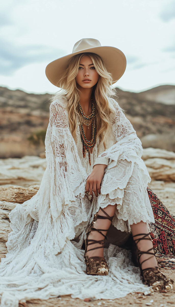
Trust The Print
Prints are the most recognizable part of our signature, and they are also the part women most often get wrong when they try to dress this way. The mistake is treating a print as a statement piece to be balanced by neutrals on either side. We design our prints to carry outfits, not to be carried by them. A good print has enough information in it that the rest of the outfit can get quieter around it rather than needing to compete.
Our prints are developed in our atelier, often drawing from botanical drawings, painters we admire, and textile traditions from the countries our atelier works with. What gives them their particular quality is that they were painted or drawn by a hand before they were printed, which means the small irregularities that make a print feel alive are still in them.
When you wear a print, let it be the loudest thing in the outfit. A silk midi in a painterly floral does not need a statement shoe, a loud bag, or bold jewelry alongside it. Flat sandals, a woven bag in a soft neutral, and a simple hoop earring will read as more considered than any amount of layering.
Shapes That Move With You
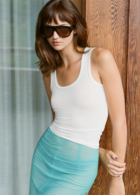
The shapes we return to most often have a particular quality, which is that they flow with the body rather than compressing it. Puff sleeves on cotton sundresses. Flutter sleeves on silk midis. Bias cuts that skim the hip without clinging. Empire waists that rise just under the bust. Ruched jersey that moves as you move. None of these are new ideas. They are old ideas we keep returning to because they work on a range of bodies, in a range of temperatures, across a range of occasions.
The silhouette logic applies beyond our own pieces. A woman dresses well when her clothes move with her body rather than fighting it. This sounds simple, and it is, but the contemporary market is full of pieces that were designed to photograph well on a hanger rather than to wear well on a body. If a piece feels like it is fighting you when you sit down, it was probably designed for the wrong reason.
Our Approach To color
The colors in our collection are rarely chosen for impact. They are chosen for how they age, how they read across light, and how they sit next to each other in a closet. Dusty roses with a gray undertone. Whites with a cream inside them. Blacks that are actually dark browns when you catch them in sunlight. Greens drawn from leaves rather than paint chips. Yellows taken from flowers. Blues closer to dye-pots than to screens.
Choose colors that look like they were made rather than printed. A dye with the slight variation of a hand-dipped cloth will always age better than a uniform one, because it has room to deepen. A color you cannot quite name in a word will almost always work harder in a wardrobe than one you can.
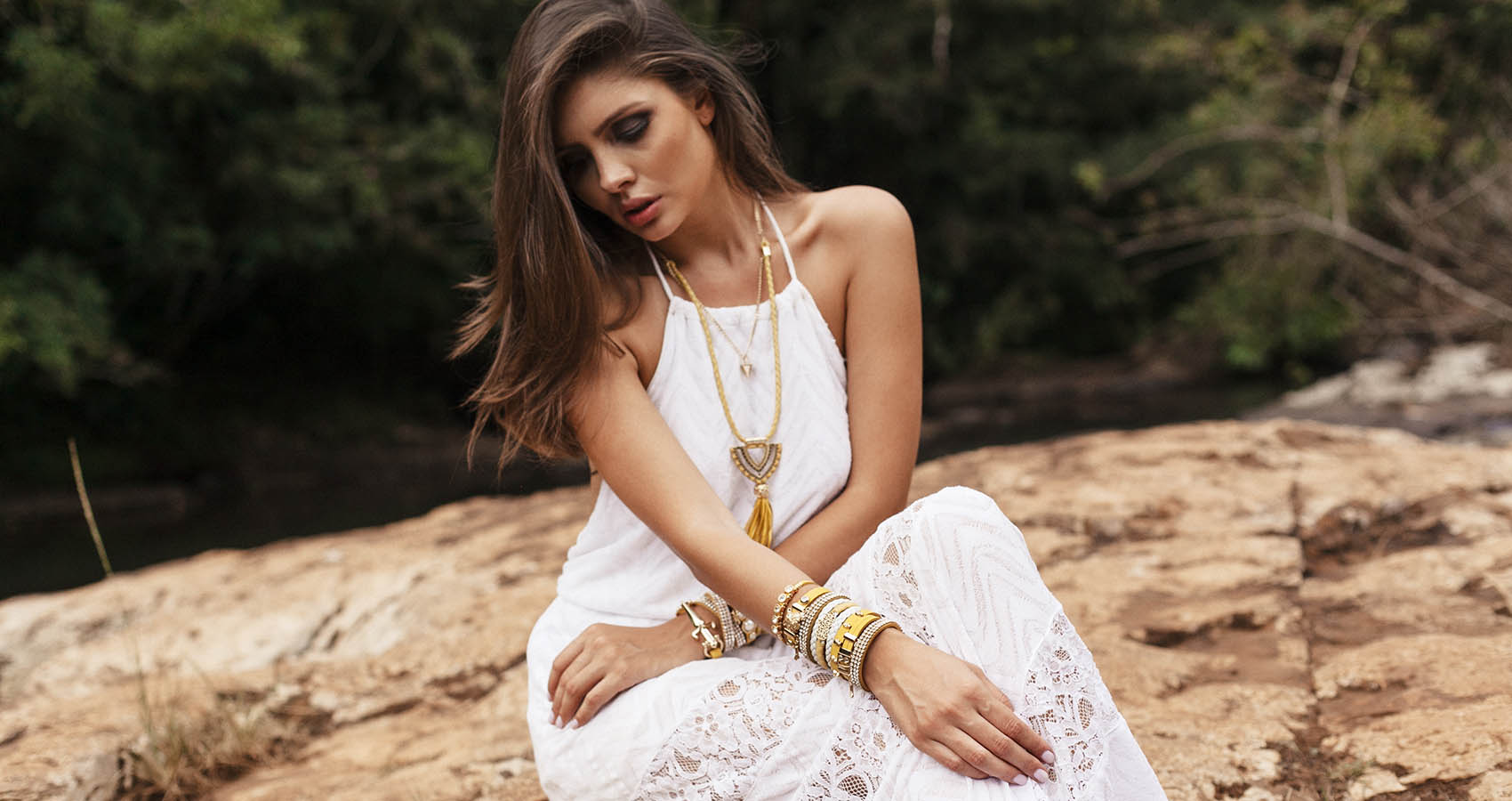
On Accessories
The last piece of the signature is the one that most people understand the least. Our accessories are deliberately quieter than our dresses. Hand-woven leather in warm neutrals, thin gold jewelry, flat sandals or simple heels, hair that looks like you slept on it and then forgot about it. The reason is that the dress is already doing most of the work. A loud bag or a sharp shoe alongside a printed silk midi creates a competition between the pieces, and the woman in the middle of that competition ends up losing.
If you have one good woven bag, one pair of flat sandals you have worn into, and a few pieces of gold jewelry you trust, you have enough for almost any summer in our register. The restraint is the point.
Dressing For The Woman You Are
The underlying principle of the aesthetic, if we had to name one, is that you are dressing for the woman you actually are rather than for a crowd, a camera, or a passing trend. The silhouettes forgive. The fabrics breathe. The prints are the kind you will still like looking at in three years. The colors will sit next to each other in a suitcase without anyone having to plan it.
If you recognize yourself in that woman, our collection is here to meet you where you are.