THE BEST NIKE LOGOS OF ALL TIME
And the history of the iconic, Swoosh.
Originally founded in 1964 as ‘Blue Ribbon Sports’, by University of Oregon coach Bill Bowerman and his former student Phil Knight, and officially became 'Nike', in 1971.
As most of you gals will know by now, Nike takes its name from the Greek Goddess of Victory. With many of its early advertisements pushing women to the forefront, this iconic brand is impossible not to love.
Thanks to the Nike Department of Archives, we have the opportunity to take a look back over Nike’s amazing history, and we’ve curated a list of our TOP 10 Nike Logos of all time. From the Swoosh to ‘Just Do It’, here are our faves!
THE SWOOSH
![]()
Originally known as ‘the Stripe’, now dubbed as ‘Swoosh’, is one of the most well-known logos in the world, and is worth a crazy $26 billion. Signifying half a running track, the wing of the Greek goddess Nike, conveying motion & speed. Seen in both Nike’s Orange and White palette, the logo is now most commonly seen in the solid black Swoosh which is recognized and loved across the globe. Back in 1971, Knight originally said “I don’t love it, but it will grow on me” – it’s hard to imagine a world where this Swoosh may not have existed.
JUST DO IT
![]()
“JUST DO IT.” Set in Futura Bold Condensed, is a trademark of Nike, as was coined way back in 1988 during a marketing meeting. Created by Ron Dumas, the slogan first appeared in 1989 and is now featured across sneakers, apparel, and in advertising.
NIKE AIR
![]()
The OG Nike Tailwind debuted in 1979, being the first to feature the now-iconic Air unit in the sole. Making a big comeback in 2018, the Tailwind has lasted through the decades, firming its place in sneakerheads rotations.
Although it was the first silhouette to introduce the technology, the Nike Air logo did not arrive until 1982. In the beginning, it was only featured on the tongue of all Air silhouettes, this logo soon became a staple and now also appears on the heel.
ACG
![]()
Although a sporting brand, it is hard to deny that Nike has now become much more than this, with each release becoming more and more aesthetically pleasing to the fashion eye. But Nike ACG (All Conditions Gear) is made for the outside, to be worn and not left in deadstock condition for the rest of entirety.
Launched back in 1989 with the Son of Lava Dome and Wildfire sneakers, accompanied by an apparel line – this Lil’ triangular logo is now one of Nike’s most recognizable.
With outdoor brands such as Arc’teryx gaining popularity in streetwear circles, Nike ACG relaunched as NikeLab ACG, under the ACRONYM’S Errolson Hugh, thrusting ACG into the limelight for tech-wear obsessed youths.
![]() AIR MAX 93
AIR MAX 93
![]()
Once known as the Air Max 270, back in 1993 the Air Max 93 was released, in the OG “Cactus” colorway. The silhouette featured a colored 270-degree air unit and a Huarache-style sock-like fit.
Alongside this release, the Black, White, and Neon 93 logo also debuted and has since started a series of other Air Max logo designs.
AIR ELEMENTS
![]()
The Air Elements Logo series was released in 1993, to represent different types of Nike Air technologies. You'll have seen these logos plenty of times if you own any TL, TN, Zoom, or Lo silhouettes.
AIR FORCE 1
![]()
The Nike Air Force 1 made its debut in 1982, originally made for basketball players, the AF1 is Nike’s most popular shoe of all time. Designed by Bruce Kilgore, the silhouette is offered in low, mid, and high-top options. This logo was the start of a large logo family and has transcended way past just sneakers.
NIKE SHOX
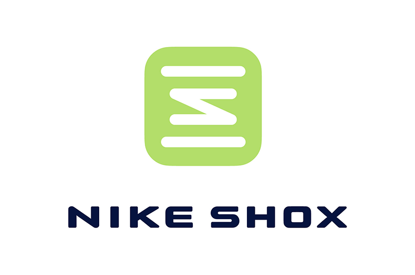
First released in 2000, the Nike Shox logo perfectly represents the new and exciting technology the silhouette brought to the sporting world. Greg Hoffman designed the logo, but Nike was unsure – so employed two different design agencies to work on the logo. But after all that work, Nike returned to the original Hoffman design and is what you will see on the back of your Shock silhouettes to this very date.
AIR MAX 95
![]()
The Air Max 95 silhouette and logo has a huge cult following, even after 25 years. Coined by Jeff Weithman, the 95 Logo, reimagines the OG, with a black and grey background, but keeping the white and neon color scheme from the original.
JORDAN WINGS
![]()
The main aim of the Air Jordan 1 was to break barriers in footwear, not only through the Black and Red colorway (which had never been seen before for basketball sneakers) but also in the logo. Nike Creative Director Peter Moore coined the idea for the Jordan Wings, whilst on a flight home from a meeting with Michael Jordan’s agent, and began drawing up the logo on the back of a napkin. You learn something new every day huh!
Next up, Nike Bring Us Pastel Perfection With Air Max 720 “Vibrant Pack”