How To Make Any Event Feel Instagrammable Without Hiring A Designer
Simple ways to make your event look designer-level.
You saw those events on Instagram. The ones with corners styled by a team of six people, a florist, and someone whose entire job is holding a steamer. The lighting is warm, but not yellow. The color scheme is logical. Somebody put up a sign on the wall that says something personal and perfect. And your first thought is: I could never get away with that for my birthday.
You can, though. You need to stop treating "Instagrammable" like a budget category and start treating it like a handful of smart choices made early.
Most events that photograph well aren't expensive. They're considered. Someone picked a color and stuck with it. They considered where guests would stand when taking photos and made sure the good light hit the right spot. That's literally it. No design degree. No Pinterest board with 400 pins and zero follow-through. Just a few decisions that punch above their weight.
This is for the girl planning a birthday dinner, an engagement party, a house party that deserves more than old string lights, or a wedding reception on a budget that still looks amazing. You don't need to hire a professional. All of it needs a tiny bit of intention.
Pick a Color Palette and Actually Commit
This is where most DIY event styling goes wrong. You start with "sage and cream," but end up with four mismatched greens, a random gold balloon, and a tablecloth that doesn't go with anything. The solution is surprisingly simple: pick two colors and one metallic. That's it, just three elements. You're done.
Using two main colors and a metallic accent gives you plenty of options to create a thoughtful look that doesn't feel too strict. Sage and cream with brushed gold? Fresh and polished. Dusty pink and terracotta with copper? Cozy and inviting. Black and white with chrome? Sleek and modern. The metallic detail pulls everything together, so your space feels complete rather than a collection of ideas that aren't quite finished.
Buy your plates, napkins, candles, and signs in just those colors. If you're using a balloon arch (which, when done well, still looks great behind a table), stick to your chosen color palette. Even one off-color can make everything look mismatched instead of put together.
The best event designers work with restrictions, not endless options. Sticking to two colors creates unity, and that unity is what makes even a phone photo look high-end.
Lighting Is the Entire Personality of Your Event
People skip right past this, but the décor is secondary. Lighting carries most of the visual weight at any event. A room lit by overhead fluorescents will make the prettiest table setting look like a work canteen. That same table under warm, low lighting suddenly belongs in a magazine.
The easiest move is candles. Clusters of pillar candles at different heights on every surface. They cost almost nothing, and they create the warmth that overhead lights kill instantly. If you're outdoors, string lights are still unbeatable (the warm white ones, not the blue-white LEDs that make everyone look vaguely ill). Layer them at different heights so they don't read as a single flat line across the space.
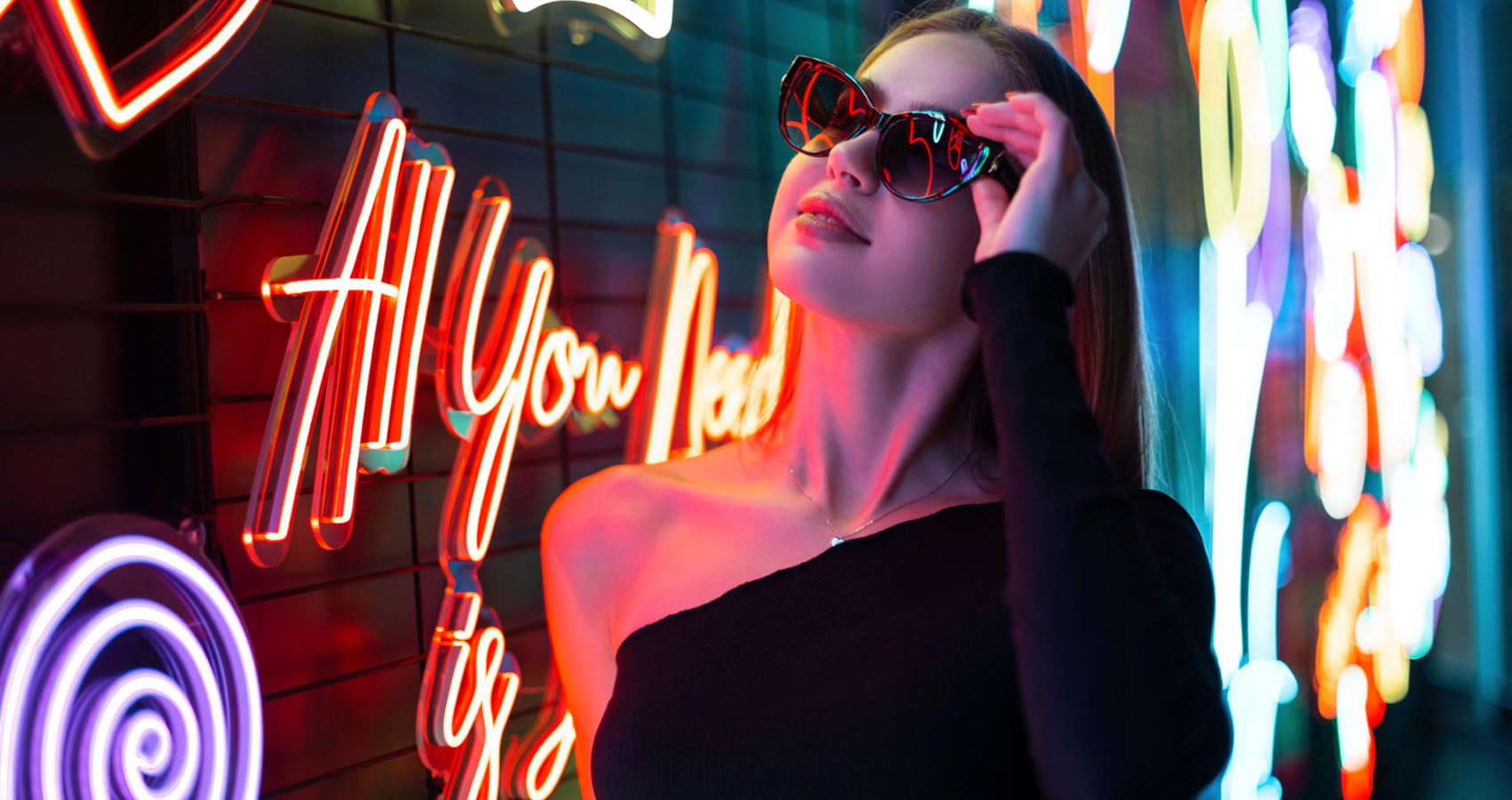
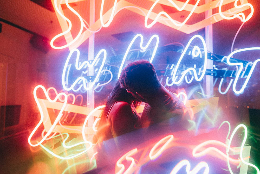
For something with more personality, think about wall-mounted lighting. That's exactly where custom neon signs for events have become a genuine go-to. A neon sign with a name, a date, or a short phrase does double duty as both décor and photo backdrop. It throws soft, colored light that actually flatters faces in photos (something overhead lighting can never achieve), and it gives the event a visual anchor that guests naturally orbit around.
You can match the sign's color to your palette, and because it mounts on the wall, it doesn't eat into table or floor space. Neon used to feel nightclub-exclusive. Now it's showing up at garden parties, bridal showers, and 30th birthdays because it solves two problems in one: it lights the room and brands the event as yours.
However you approach it, the rule stays the same: warm light, multiple sources, nothing overhead as the primary. Your phone camera will thank you.
Create One Proper Photo Spot (Not Five Bad Ones)
This is a mistake I see constantly. People are trying to make every single corner of their event photo-worthy. You end up with six half-finished vignettes, and none of them actually work. One strong photo spot beats five mediocre ones every single time.
Pick a wall. Style it with intention. That's where your centerpiece moment lives. A balloon arch with a floral cluster at the bottom works. Or a fabric draped backdrop with a few candles in front of your neon sign attached to a dessert table. Whatever you choose, make it deep (with elements at different heights and different distances from the wall) and contrasting (your palette colors playing off each other). There should be space for two people to stand comfortably in front of it.
The depth thing is not optional. Flat backdrops photograph flat. If your entire photo moment is one plane (a banner taped to a wall, for instance), it'll look exactly as cheap as it cost. Adding dimension is what tells the camera this space was styled, not just decorated. A shelf with candles, a table pulled slightly forward, and hanging greenery at different levels. That's the difference between a backdrop and an experience.
Quick test: before the event starts, stand where your guests will stand and take a selfie. If the background looks good at that angle, you're sorted; if it doesn't, adjust now. Not later. Not once have people been holding drinks. Now.
The Details That Actually Show Up in Photos (and the Ones That Don't)
Half the things you spend time on won't be visible in a single photograph. That centerpiece you spent two hours arranging? Below the crop line in most group shots. The custom cocktail stirrers? Adorable in real life, invisible on a screen.
What does show up: anything at head height or above. Hanging installations, wall décor, signage. The backdrop you built. The lighting. And the room's general color tone. If your palette is tight, even a random candid in the corner will look intentional because the colors agree with each other.
Textures matter too, but only at close range. Linen tablecloths photograph differently from polyester. Real candles read differently from battery-operated ones. Fresh flowers have a depth that faux florals can't quite match. You don't need high-end for everything, but for items in photos that sit near eye level or within arm's reach, choose materials that catch light well: linen, glass, matte ceramics, brass, and natural greenery.
Your phone camera picks these up as "expensive" even when they're not.
Skip the stuff that only matters if someone zooms in. Spend on the stuff that matters at arm's length.
The "It Looked Better in My Head" Problem
Real talk. DIY event styling sometimes disappoints. You had a vision. You bought the supplies. You set everything up. And something feels... off. That gap between "Pinterest board" and "my living room" is real, and pretending it doesn't exist doesn't help anyone.
Nine times out of ten, the issue isn't your supplies or your taste. It's spacing. Things are too crowded, or too spread out, or placed at the same height across the board. The eye has nowhere to travel. Visual rhythm matters in event styling, just as it does in fashion. You wouldn't wear a patterned top, patterned trousers, and patterned shoes. You'd let one piece breathe. The same logic applies to a table or a backdrop.
The fix: step back, physically, and look at the full scene from six feet away. If nothing jumps out as the focal point, move things around until something does. Rearranging what you already have costs nothing. And sometimes all a setup needs is one thing removed, not one thing added.
Styled events that photograph well aren't about money, natural talent, or having a friend who "just has an eye for it." They come down to a handful of principles applied with discipline: limited color, warm light, one strong focal point, and the confidence to stop before you overdo it.
The best events I've been to weren't the most decorated. They were the most edited. The host knew what to leave out.
So light the candles, hang the sign, trust your three colors, and leave the rest alone. Your guests are going to post about it whether you ask them to or not. Let's make sure the background holds up.