




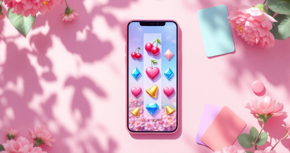
How Social Media Trends Shape The Look Of Free-Play Casino Apps
From Vegas vibes to Liquid Glass.
If you’ve spent any time scrolling TikTok lately, you’ll know that pretty much everything has started to look the same.
Your feed might jump from a GRWM to a runway edit to a beauty ad, and somehow a casino app can appear in between without looking completely out of place. The colors are softer, the fonts are rounded, the animations are bouncier, and everything is designed to look good in a vertical frame.
It’s a very different world from the casino-app aesthetic I remember.
A decade ago, these apps seemed to take most of their inspiration from actual casinos: deep purple and oxblood backgrounds, shiny gold lettering, glowing slot machines and buttons that looked like they belonged on an arcade cabinet. That style hasn't disappeared completely, but now it has to share the screen with pastel gradients, frosted panels, playful typography and interfaces that move almost like a social media carousel.
And honestly, I find it pretty fascinating.
From Green Felt To Liquid Glass
For a long time, digital design loved pretending to be something physical. Apple was particularly committed to it. Remember the green felt and polished wood of Game Center on iOS 6? It was basically a virtual card room.
Then iOS 7 arrived in 2013 and Apple went in the complete opposite direction. Out went the felt, stitched leather and fake paper textures, replaced by a much flatter and cleaner look.
Casino apps didn't get the memo quite as quickly.
Slot screens continued to embrace chrome reels, gem-like buttons, gold numbers and plenty of dramatic shadows. And when you think about it, it makes sense. If the entire point of the interface is making a win feel exciting, why wouldn't you make everything look shiny?
Then digital design started changing again.
Google's Material Design, introduced in 2014, brought shadows and layers back in a much more controlled way. And in 2025, Apple went even further with Liquid Glass, its translucent new design language for iOS 26.
Suddenly, depth was cool again.
That makes casino apps look a little less like the odd one out. Their love of shiny buttons and layered interfaces suddenly feels much more connected to the rest of the digital world.
Of course, there's a downside to all that transparency and movement. Writing for Nielsen Norman Group, Raluca Budiu argued that Liquid Glass left iOS 26 less usable, particularly when translucent controls are placed over busy content.
And this is something casino apps have been dealing with forever. Try reading a gold win counter while a colorful slot machine is flashing behind it and you'll understand the problem.
Cloud Dancer Meets The Casino Carpet
Color trends have an even bigger influence.
Pantone named Cloud Dancer (PANTONE 11-4201) its Color of the Year for 2026, marking the first time the company had chosen a white since it began its annual Color of the Year tradition in 1999. As NPR reported on the pick, Pantone positioned the shade as a calming response to a world that could probably use a little more quiet.
We've already seen that softer mood everywhere: oat-milk neutrals, butter yellow, beige interiors, pale pinks and endless minimalist mood boards.
A casino app obviously isn't going to turn completely white overnight. Where's the fun in that?
But it can borrow the idea. Instead of covering the entire screen in purple and gold, a softer background can make those saturated colors feel more exciting when they do appear.
Laurie Pressman, vice president of the Pantone Color Institute, said the white “reflects what people are looking for.” And whether you're looking at a fashion mood board or a casino lobby, the basic idea is the same: when everything around the statement piece is quieter, it gets to do more of the talking.

Screenshots Are Basically Mini Campaigns Now
There is another very social-media-coded part of the experience: the app store itself.
Before you even download an app, you might see a row of screenshots showing you what it looks like. Apple lets developers upload up to 10 screenshots to a product page, meaning those images have to work surprisingly hard.
They're basically a mini campaign.
The first few frames need to grab you immediately, just like the opening slide of an Instagram carousel. The backgrounds flow into each other, the text is huge and easy to read, and the most exciting part of the app is usually front and center.
Instagram has obviously helped shape this visual language. The platform expanded carousels to 20 slides in 2024 and moved to a taller 3:4 profile grid in 2025. That shift towards portrait, full-screen imagery is now familiar everywhere.
Casino apps are simply playing the same game.
The trickiest part is fitting everything onto the screen. Sweepstakes-style apps can have coin balances, stores, menus and rules text competing for space, while the actual game is still trying to look exciting.
The result can be a lot.
Good design gives the important information somewhere consistent to live instead of hiding it underneath a pile of sparkles and confetti. The wording around those rules is also subject to regulations that vary between states, and Legal Sports Report's sweepstakes casino regulations coverage follows those changes.
And then there is the screenshot itself.
Obviously, nobody wants to advertise the boring part of an app. So every image gets the most exciting possible moment: the wheel is spinning, the meter is almost full, the coins are flying and the reels are about to land.
It's basically the digital equivalent of only posting your best vacation photos.

Everything Is Designed For The Scroll
This is probably where social media has had the biggest influence.
We've become accustomed to portrait video, immediate hooks, looping animations and interfaces that respond to every little touch. If something feels slow or stiff now, we notice.
Even our phones have raised our expectations. When Apple brought its 120Hz ProMotion display to the standard iPhone 17 in 2025, smoother movement became less of a premium feature and more of something you simply expect.
Google has been thinking about this too. Its Material 3 Expressive design system, announced in 2025, came after 46 research studies involving more than 18,000 participants. According to Google Design's research, participants were able to spot key interface elements up to four times faster in the expressive versions.
And the numbers get even more interesting: Google reported increases in how modern, rebellious and connected to subculture the designs felt.
Basically, looking cool isn't just a matter of taste anymore. There is research behind it.
Casino apps have plenty to work with here because movement is already such a huge part of the experience. Reels slow down before landing, buttons squash when you press them, coin counters roll upwards and little bursts of animation celebrate a win.
Add haptic feedback and suddenly you're not just watching the screen — you're feeling it, too.
The vertical format changes things as well. A modern casino lobby can stack cards and games vertically, encouraging you to swipe through them in much the same way you'd move through Reels or a TikTok feed.
It's hard to imagine a more natural fit for the current internet.

When Every App Starts Looking Like The Feed
But there's something slightly funny about all of this.
The whole reason these trends work is because they make apps feel familiar. If your casino app uses the same colors, shapes, animations and typography as the rest of your phone, it immediately feels more current.
The problem is that when everyone borrows from the same handful of platforms, everything can start looking the same.
A casino app, a banking app and a sneaker store can suddenly share the same frosted buttons and rounded typography. The old casino aesthetic might have been a little tacky, but at least you knew exactly what you were looking at.
Maybe that's why some of the old visual language is worth keeping.
A little gold. A little drama. A ridiculous amount of sparkle.
There is also something to be said for knowing when to stop. A feed and a casino lobby might look increasingly similar, but they are still different experiences. Not every interaction needs to bounce, glow, vibrate and explode into confetti.
Sometimes the most effective design choice is giving the user a second to breathe.
And that might be the next trend worth watching.
Color trends will keep moving, interfaces will keep getting smoother, and platforms will keep finding new ways to make us stop scrolling. Pantone will announce another Color of the Year, social media will decide whether we love it, and eventually we'll probably see that shade appear somewhere behind a slot reel.
Maybe it'll be another soft neutral.
Or maybe we'll be back to oxblood and gold before we know it.
Either way, I'm curious to see what the casino apps look like when the next trend comes around.










 Connect with Facebook