Picture Hanging 101: Tips from The Pros
Pro secrets for perfec placement.
Your walls are staring at you. Blank, boring, and begging for some personality. I've been there — standing in my living room with a beautiful piece of art in one hand & a hammer in the other, wondering how professionals make it look so effortless. After years of crooked frames, nail holes in wrong places, and pictures that mysteriously slide sideways overnight, I've finally cracked the code.
Picture hanging isn't rocket science, but there's definitely an art to it. The pros have their secrets, their tools, and their time-tested methods that separate stunning gallery walls from wonky disasters. Let me share what I've learned from watching the experts work (and from making plenty of mistakes myself).
Getting Your Tools Right
First things first — you need the proper kit. I used to think a hammer and some nails would do the trick. How wrong I was! Professional picture hangers carry a specific arsenal, and once you understand why, it makes perfect sense.
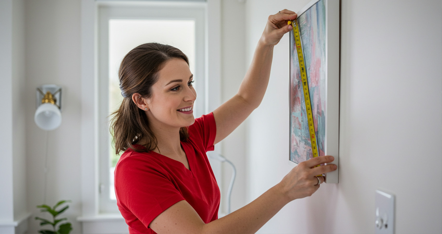
A decent spirit level is absolutely essential. Not one of those tiny keychain ones, but a proper bubble level at least 60cm long. Why? Because your eyes lie to you constantly. What looks straight often isn't, and walls aren't always perfectly vertical either. Trust me on this one — I've rehung the same picture three times because I thought I could "eyeball it."
Picture wire, not just any old string or cable. Professional hanging wire is designed to distribute weight evenly and won't stretch over time like cheaper alternatives. You'll also want wall anchors — proper ones. Rawlplugs for masonry walls, hollow wall anchors for plasterboard. The pros always match the anchor to both the wall type and the weight they're supporting.
A stud finder might seem like overkill, but for heavier pieces, finding solid timber behind plasterboard walls is crucial. These gadgets have improved dramatically in recent years, though they still occasionally give false readings near electrical cables.
The Height Game
Here's something most people get wrong: picture height. Walk into any amateur's home and you'll see artwork hung too high, too low, or inconsistently throughout the room. The pros have a simple rule that works almost every time.
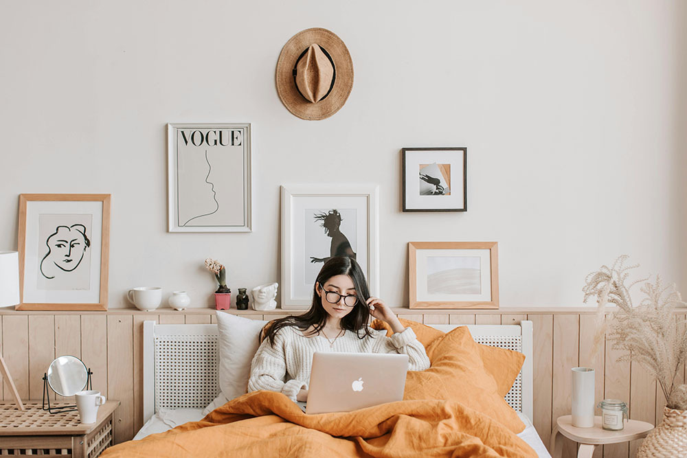
The centre of your picture should sit at eye level — roughly 145-150cm from the floor for most people. But here's the clever bit: measure from the centre of the frame, not the top or bottom. This creates visual harmony that your brain recognises even if you can't articulate why it looks "right."
For dining rooms, the calculation changes slightly. Since people spend most time seated, drop that centre point by about 10-15cm. Bedrooms follow the same logic — consider sightlines from the bed, not just standing positions.
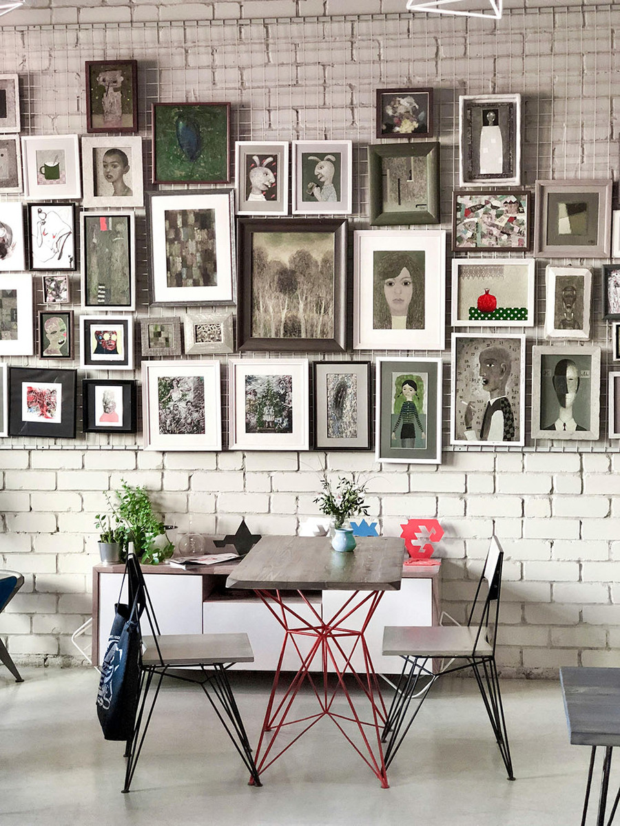
Groups and galleries walls require more planning. Professional installers often cut paper templates matching each frame's dimensions, then arrange these on the wall with masking tape before making a single hole. Sounds tedious? Perhaps, but it prevents expensive mistakes.
Weight Distribution Secrets
This is where many DIY attempts fall apart — literally. Understanding how weight transfers through hanging systems separates successful installations from damaged walls and broken frames.
For lightweight pieces (under 2kg), a single nail often suffices. But here's a pro tip: angle that nail slightly upward, about 10-15 degrees from horizontal. This creates a small lip that prevents the frame from sliding off if vibrations or settling cause movement.
Medium weight artwork (2-10kg) benefits from two-point hanging systems. Not just two nails side by side, but properly spaced points that distribute load across a wider wall area. The spacing should match your frame's hanging hardware — usually about two-thirds of the frame's width apart.
Heavy pieces demand serious consideration. Anything over 10kg should really go into solid walls or timber studs. I've seen too many expensive prints come crashing down because someone trusted hollow wall anchors beyond their limits. When in doubt, overengineer rather than risk it.
Dealing With Difficult Walls
Not all walls are created equal, and professionals adapt their techniques accordingly. Brick walls, for instance, require masonry bits and proper rawlplugs. Don't try to hammer nails directly into brick — you'll just create ugly chips and weak attachment points.
Old plaster walls present unique challenges. They're often harder than modern plasterboard but can be brittle around fixing points. Pre-drilling pilot holes prevents cracking, even for small nails. Use a masonry bit at slow speed to avoid generating heat that might cause plaster to crumble.
Plasterboard walls are forgiving for light loads but become tricky with heavier pieces. Hollow wall anchors work well, but positioning matters enormously. Too close to edges or corners and you risk breaking through into the cavity behind.
Textured walls — those Artex nightmares from the 1970s — need special consideration. The texture hides imperfections but makes precise levelling harder. Some pros actually embrace this, using the texture's randomness to disguise slight variations in a gallery wall arrangement.
Professional Spacing Techniques
Spacing is where amateurs reveal themselves most obviously. Professional installers understand visual weight, optical balance, and how the human eye processes arranged objects.
The classic rule suggests 5-10cm between frames in a group, but this varies with frame size and visual content. Bold, colourful pieces need more breathing room than subtle photographs. Large frames can sit closer together than small ones without looking cramped.
Ceiling height affects spacing decisions too. In rooms with high ceilings, you can group pictures more tightly and still maintain visual balance. Low ceilings require more generous spacing to prevent walls from feeling cluttered.
Corner placement often gets overlooked. Pictures too close to room corners can feel squeezed, whilst those too far away seem to float aimlessly. The sweet spot is usually about 15-20cm from internal corners, though this depends on surrounding furniture and room proportions.
Lighting Considerations
Here's something that took me years to appreciate: lighting makes or breaks picture presentation. The pros always consider how natural and artificial light will interact with their installations.
Direct sunlight fades artwork over time, but completely avoiding natural light isn't always practical or desirable. UV-filtering glass helps, though it adds cost and weight. Positioning pieces perpendicular to windows reduces glare whilst still allowing some natural illumination.
Artificial lighting requires planning too. Spotlights or picture lights create drama but need careful angling to avoid harsh shadows or reflective glare. The key is even illumination across the artwork's surface — easier said than done with glossy frames or protective glass.
Room lighting affects colour perception significantly. Warm LED bulbs make reds and yellows more vibrant but can muddy blues and greens. Cool lighting does the opposite. Professional galleries often use neutral colour temperature lighting (around 4000K) to maintain colour accuracy.
Common Mistakes to Avoid
I've made most of these errors myself, so consider this hard-won wisdom rather than theoretical advice. The biggest mistake? Rushing the process. Picture hanging rewards patience and planning.
Measuring incorrectly happens constantly. Always measure twice, drill once. But more importantly, understand what you're measuring. The distance from hanging hardware to frame top isn't the same as the distance your nail needs to sit above your desired picture position.
Ignoring wall studs when hanging heavy pieces is asking for trouble. That expensive mirror might hang successfully for months before gravity wins. I learned this lesson when a family photograph crashed down at 3am — the noise was terrifying, the damage heartbreaking.
Mixing hardware styles within the same grouping looks unprofessional. If you're creating a gallery wall, use consistent hanging methods throughout. Mixing wire hangers with sawtooth brackets creates uneven positioning that's impossible to correct satisfactorily.
Scale mistakes are surprisingly common. Tiny pictures on vast walls look lost and insignificant. Oversized pieces in small spaces feel overwhelming. The pros often recommend artwork should occupy roughly 60-75% of available wall space for optimal visual impact.
Final Thoughts
Picture hanging combines technical skill with aesthetic judgement in ways that aren't immediately obvious. The professionals make it look effortless because they've developed systems, learned from mistakes, and understand that good preparation prevents poor performance.
Take your time, invest in proper tools, and don't be afraid to experiment with paper templates before committing to holes in your walls. Your pictures deserve to be displayed properly — and your walls deserve better than becoming Swiss cheese through trial and error.
Most importantly, remember that rules can be broken creatively once you understand why they exist. The pros follow guidelines until they have good reason not to. Perfect symmetry isn't always the goal; sometimes character and personality matter more than mathematical precision.