





Interface Design Is 2026's Newest Status Signal, And Casino Platforms Noticed First
Why the way an app feels is becoming a new form of status.
You notice it before you can name it. A friend hands you their phone to show a playlist, and the app just feels expensive. The type sits right, the tap lands with a soft weight, nothing stutters when you scroll. You have not spent a cent, but something in that half second reads as taste, the same way a well-cut coat or a pair of quietly rare sneakers reads across a room. That small pause is the trend hiding in plain sight.
Fizzy Mag readers know how this works in cloth. For years status lived in a logo you could spot at ten paces. Then it moved somewhere subtler, into fabric weight, stitch density, the confidence to wear something plain and let the fit talk. Screens are catching up. In 2026 the interface itself has become a status signal, a way a product tells you who it thinks you are before you read a word of copy.
Digital operators built on constant attention felt this shift early, and comparison hubs now sort them partly on that polish. Bonus.com's guide to the top online casinos real money sites is a reviewer's directory that weighs how a real-money platform looks and behaves against its licensing and payout record, which is a useful place to watch design signals get treated as a rankable trait rather than decoration.
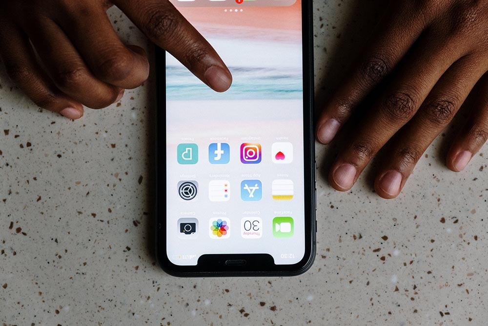
When everything works, polish becomes the flex
The old differentiators have flattened. Most fashion e-commerce loads fast now. Most streaming apps play in a tap. When the baseline is competence, competence stops impressing anyone, and the eye hunts for the next tier of difference. That is what happened to minimalism, where a decade of clean basics made "clean" invisible and pushed the trend toward texture and detail, as Fizzy Mag has tracked in the return of ornamented, personality-heavy clothing.
On a screen the equivalent flex is restraint you can feel. Motion that has physics. Spacing that breathes. None of it shouts, and that is the point.
Why the interface became the new fabric
Taste migrated to where we spend our hours, and we spend them looking at glass. A garment signals through material you can touch. An app signals through material you can only sense, latency, easing curves, the honesty of a loading state. The craft is real even though it is invisible, which is why design-literate audiences treat a sloppy interface the way a stylist treats a puckered seam. Gaming helped: it trained a generation to read interface as identity, from avatar fits to menu design, and that vocabulary now travels to every other app they open.

How the market answers it
Attention businesses respond fastest, because for them the interface is the whole product. Real-money casino platforms are a blunt example. They have no showroom, no fabric, only the screen, so it has to carry every ounce of trust and taste at once. That pressure makes them an early test case for design as a signal, which is why review sites now grade layout clarity beside load-bearing facts like licensing and cashout speed.
The honest catch is that polish and worth are not the same thing. A gorgeous interface can wrap a bad deal as easily as a good one, and the math underneath never changes to match the surface. The house keeps a built-in mathematical edge no amount of motion design removes. Reading the surface is a starting filter, not a verdict.
How to read a design signal
Treat the interface like a garment on a rack. Some details are genuine construction, some are fast-fashion mimicry. The trick is knowing which tells point to substance and which just perform it.


The honest limits of a pretty screen
A signal is a hint, not proof. A flawless landing page can front a company with no accountability, exactly as a knockoff can nail the silhouette and fall apart at the seams. For anything involving money the surface should send you deeper, into the license number, the withdrawal terms, the independent reviews, not stop you at the aesthetic.
Real-money casino play in the United States is legal in only about seven states, including New Jersey, Pennsylvania, and Michigan, and it is strictly 21 and up. Outcomes run on RNG and fixed odds with that house edge baked in, so treat any beautiful platform as entertainment with a real cost, set limits, and if play stops being fun, call 1-800-GAMBLER. The design can be honest and the risk can still be real.

FAQ
What is the first thing to check on an interface I do not trust?
Look at the boring parts before the pretty parts. Find the legal footer, the licensing details, and the terms. A team confident in its substance makes that information easy to read, not hard to find.
Does good design mean a platform is safe?
No. Polish signals investment and attention to craft, but it says nothing about fairness, odds, or whether a company honors payouts. Treat it as one filter among several, never a conclusion.
How can I tell real interface craft from cheap imitation?
Watch the small motions and the empty states. Genuine craft shows in how a screen handles waiting, errors, and edge cases, because those are the moments a template cannot fake and a lazy team ignores.
Why do attention-heavy apps invest so much in design?
Their product is the screen and nothing else, so it carries all the trust and taste at once. That pressure pushes them to treat design as a competitive feature, not a finishing coat.
What outside sources help me judge an interface honestly?
Pair your own read with independent reviews and a grounding in the craft itself. A reference like the overview of user interface design principles gives you the vocabulary to name what you are sensing instead of just reacting to it.










 Connect with Facebook