Looking for Color Combinations? Check Out an Online Slot Machine
Design hacks hiding in plain sight.
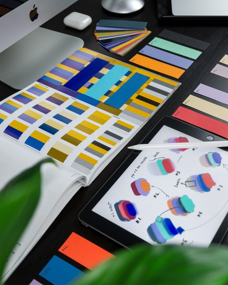
If you’ve ever hit creative burnout trying to pick the perfect color palette, here’s a hot take: maybe you’re looking in the wrong places. Fashion? Sure. Nature? Definitely. But what about... online slot machines?
Yep, those flashy little grids on your screen aren’t just for spinning reels and bonus rounds. Casino game developers, especially the ones behind titles on platforms like Jackpot City, are design nerds in disguise. They craft visual worlds where every shade, highlight, and hue is there for a reason - to spark emotion, keep you hooked, and make the whole experience pop.
And if you’re working on a brand, planning a shoot, or just jazzing up your room? These games might be your new secret weapon.
Game Designers Know What They’re Doing (Trust Me)
Think about it. Slot games have seconds to grab your attention. No tutorial. No warmup. Just pure, high-stakes design. That means the visuals have to do a lot of heavy lifting, especially the colors. Let’s break down how three popular titles - all with wildly different vibes - use color as a tool, not just decoration.
Sugar Rush (Pragmatic Play): The Sweet Tooth Palette
If Lisa Frank designed a slot game in 2025, it would be this. Sugar Rush is an explosion of pastels, pinks, and purples, layered with soft gradients and sprinkled with candy-shaped symbols. It’s the visual equivalent of a sugar high - playful, nostalgic, and aggressively fun.
The use of color here isn’t random. These tones tap into memories and comfort. Comfort aesthetics, a style that’s everywhere right now, from dopamine dressing to interior decor TikToks. If you're building a brand that wants to feel approachable, bubbly, and light-hearted, you might want to study this grid closely.

Gonzo’s Quest (NetEnt): Moody, Earthy, Iconic
Now flip the vibe completely. Gonzo’s Quest is what happens when Indiana Jones meets visual minimalism. Instead of rainbow chaos, you get grounded colors - stone greys, jungle greens, and weathered golds. The entire thing feels a little ancient, a little mysterious, and totally immersive.
This color scheme gives off "let’s go explore hidden ruins" energy. And guess what? It works because it's consistent. Whether you're building a moody website or branding something in the outdoor/adventure niche, Gonzo’s Quest is proof that muted palettes don’t mean boring.
Reactoonz (Play’n GO): Neon for the Bold
Then there’s Reactoonz - pure chaos in the best way possible. Think quirky alien characters glowing in neon blues, electric greens, and hot pinks, all against a deep navy backdrop. It’s weird, loud, and kind of amazing.
What makes this palette work? Contrast. The dark background lets the colors shout without becoming overwhelming. It’s ideal inspiration for high-energy creative projects - club posters, gaming merch, digital art. Basically, anything that should feel loud and unapologetically extra.
Why This Actually Matters
In the creative world, color is mood. It’s tone. It’s the difference between “meh” and “I need to screenshot this.” And when you’re choosing a palette - whether for a fashion line, a logo, or even your next nail set - understanding what different combinations do is huge.
Slot designers have already done the testing for you. These palettes aren’t just pretty; they’re optimized to provoke reactions. And platforms like Jackpot City are full of these micro-universes, each one serving a different aesthetic story.
One More Thing (Because It’s 2025)
In a year where we’re all bouncing between maximalism, Y2K throwbacks, and AI-generated design trends, finding color inspiration that feels intentional is rare. So the next time your Pinterest board feels stale, do something weird. Open a casino game. Study how those colors hit. Screenshot the combos that speak to you.
Who knows? Your next big design breakthrough might come from a gummy bear scatter symbol or a glowing alien with three eyes.
TL;DR (But Seriously)
Online slots are more than flashing lights and bonus rounds. They’re color theory playgrounds. So next time you're chasing aesthetic inspiration, ditch the swatches and try spinning the reels instead. You might just hit - creatively speaking - the jackpot.