I Shop Therefore I Am: The Controversial History Of The Supreme Box Logo
From Bauhaus to NYC skate shop.
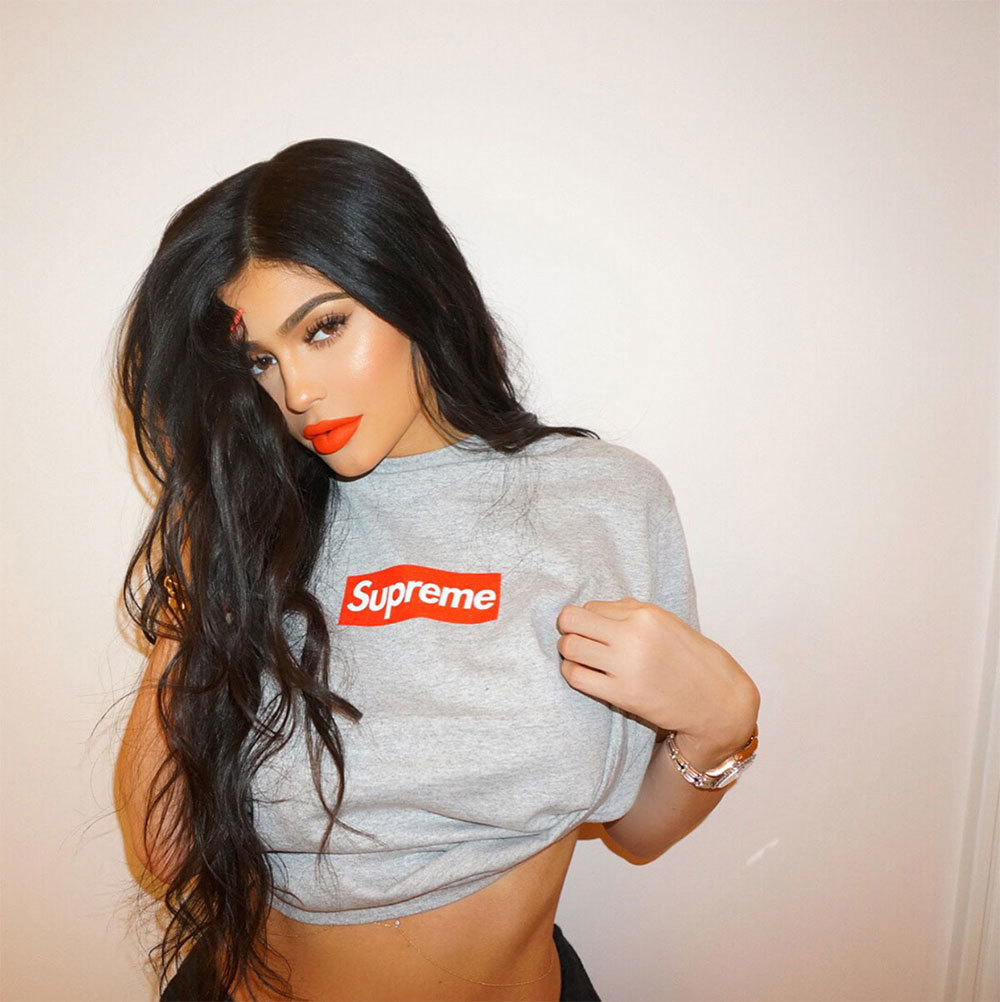
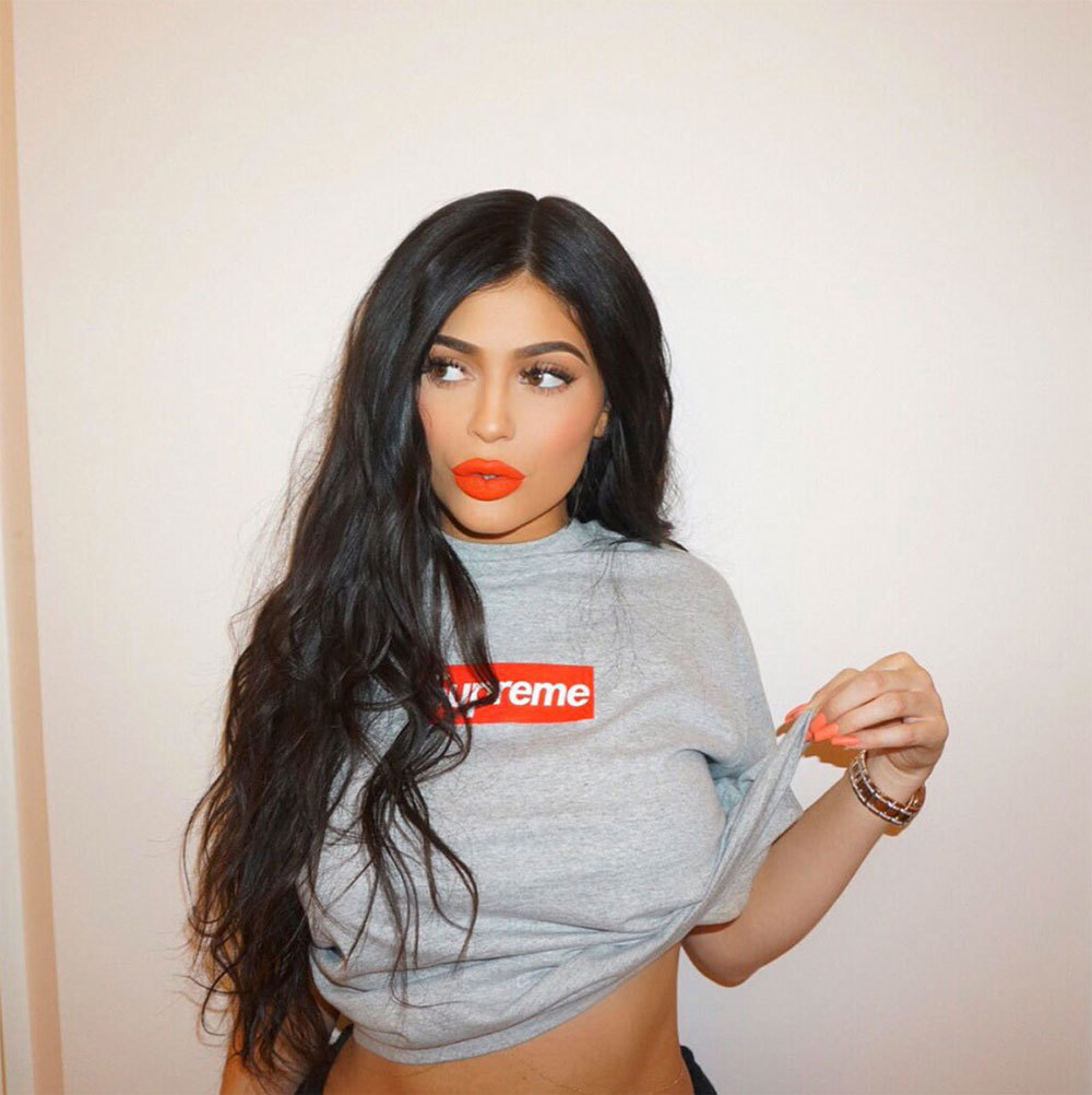
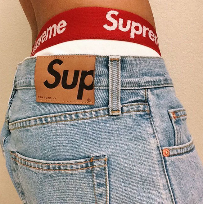
Founded by James Jebbia in 1994, Supreme's first store opened in downtown Manhattan, designed with a unique, large central space so that skaters could ride right in with their boards and browse the cool selection of tees and skateboards. Supreme's iconic box logo was created at the same time, its statement simplicity becoming an instant hit with the hip clientele. Nowadays Supreme has risen to such cult status that skateboarders, streetwear heads, collectors and high fashion figures habitually lose it about anything emblazoned with the logo, as if its been sprinkled with gold dust (*cough* Supreme brick *cough*), despite having no idea about its provenance.
With such ridiculous levels of demand comes stories, myths and controversies, making the history of the box logo quite an interesting, if not a rather unclear, one. What we do know for certain is that the font, Futura Bold Italic, was created in 1927 by Paul Renner, based on the geometric shapes that became representative of the Bauhaus design style of the time. In 1979, artist Barbara Kruger used the font for her propaganda piece Untitled (I Shop Therefore I Am), the words “I shop therefore I am” a criticism of consumer-driven society. The bold white typeface sits on a red box background – stick the artwork on an expensive t-shirt today and you could probably fool even the most dedicated of hypebeasts.
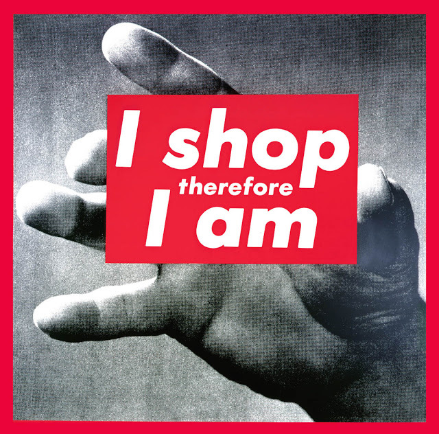
Supreme, despite being well-known for co-opting other people and other companies' design elements, denied copying Kruger's work, instead admitting to using Renner's font in the same way at a copyright infringement legal case back in 2013. It wasn't Kruger suing Supreme, however, but Supreme suing Married to the Mob's Leah Sweeney for her parodical “Supreme Bitch” merch. As Complex reports, Kruger has been pretty quiet about Supreme's red-and-white logo, despite the commercial entrepreneurs that originally inspired her work profiting off the template she arguably set. When asked to comment, Kruger responded with the following.
“What a ridiculous clusterfuck of totally uncool jokers. I made my work about this kind of sadly foolish farce. I'm waiting for all of them to sue me for copyright infringement.”
You can't help but see the irony here, but we're sure this was exactly Jebbia's intention. Case in point: that retro Supreme logo with the accented “e” was inspired by André Courrèges, the designer who popularized the mini-skirt back in 1965.
All Images via Instagram and blogspot.com